Hi, everyone. Wrinklethony Shirttano here, the Internet's busiest music nerd. I hope you're doing well. It's time for a rant. It's not a rant I want to do or I'm looking forward to doing because I feel like on this channel, we have ranted literally on this topic at least a few times. What I'm talking about once again here is the late rapper, singer, and songwriter, Juice WRLD.
When it comes to popular musicians who have passed tragically in the past 10 years, few have had the staying power, the demand, the prolonged discourse and fandom that Juice WRLD has. I mean, it was just recently that this guy got a Fortnite avatar and everything, which is crazy. As a force, as a name, as an artist, that is staying power. And another part of this staying power is just this increased consumption and demand of Juice WRLD's music. And in a way, the upside of that is that while Juice WRLD was here and was active, he was a very prolific creator and recorder. He left us with quite a bit of music to go by, for sure. And also on top of that, seemingly, there is a lot of Juice WRLD music in the vault as well, because there are also a few artists who have passed away in the last 10 years that we keep continually getting new music from again and again and again and again, be it a single or an entire project or a collaboration, a feature, a crossover.
For an artist who is no longer with us, we do get an awful lot of Juice WRLD music on a very regular basis. We are gearing up once again to get more from an upcoming project that has been announced, The Party Never Ends. This announcement coincided with the new formal release of a track featuring Nicki Minaj, too. But here's the issue. The music we've been progressively getting from the Juice WRLD camp from his label, which I believe at this point is still spearheaded by Lil Bibby. Yeah, the Juice WRLD music we have continued to get is just getting worse and worse and worse and worse.
Either it's redundant and it doesn't really add to his catalog. It doesn't really make for the best stuff he's ever written, or performed, or released, as Juice WRLD was very clearly the artist who would just record a lot, record profusely, just do all of his tracks and everything on the fly, and then pick out of what was left over to just grab the highlights and put those onto records. Which I mean, that's a valid way to go about your process. But that doesn't mean every single thing he did in every single moment or recording that we could possibly cobble together should see the light of day. But continually, again and again, that is what we get from the Juice WRLD camp.
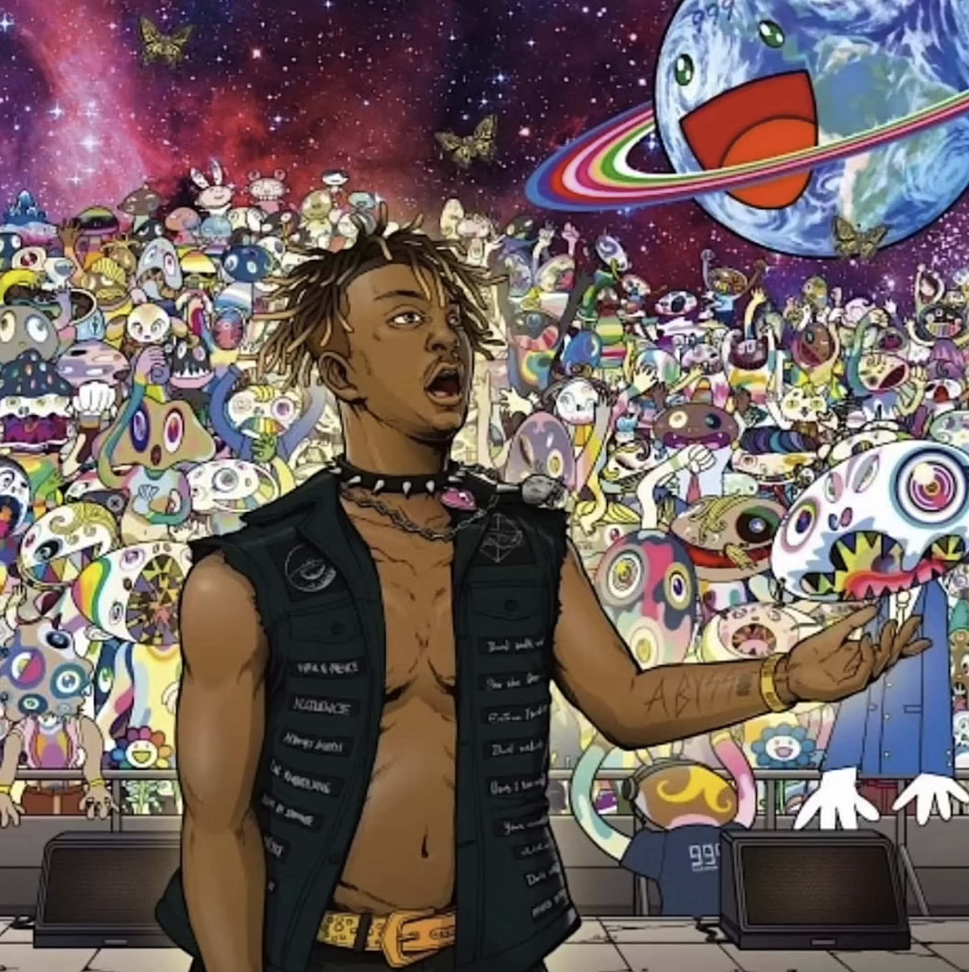
And not only are my hopes for the quality of this music not that high, but fans were shocked to see that the cover art to this album is absolutely God awful. Straight up the ugliest trash to be on the front of any Juice WRLD project so far. And it wasn't that long ago that we had the cover art to The Pre-Party project where he looks like some demented anime character sliding down the globe puking up lean.

This drawing is horrible. What is this? This is awful. This is like something a 12-year-old draws on their binder. And yet, the cover art to this new project here is even worse. What's even more shocking is that it was actually created by Takashi Murakami, a legendary Japanese visual artist. The guy who's made the cover art for projects such as a Kids See Ghosts, as well as Graduation. Yeah, that Takashi Murakami. When people first saw this album art, I swear to God, there were reactions on social media like, 'Is this just some guy who's ripping off Murakami? This can't possibly be him.'
But no, it's actually him.

And this cover art, I can't even begin to describe how terrible this is. I just have so many questions. Why do his abs look like stickers that were pasted onto his stomach with wood glue? Why is his skin camouflage? The face and the expression on the face, frankly, looks ridiculous. Come on, be for real. This does not look like a quality Murakami piece that a lot of thought and heart went into. This looks like a fucking Bored Ape NFT.
Yes, this looks like a crappy NFT artist that is ripping off Murakami style. But that's what's in the forefront of this picture. We haven't even addressed the background. The term eyesore doesn't even begin to cover how the crowd in this image looks. Every single figure in the background looks like some ugly Murakami AI ripoff that was individually photoshopped and then shrunk to fit into the background somewhere. What is this three-eye thing with a multi-color camo face? What is this other thing? Is this a hamburger with an eye and hair going over its head? What is this What is this other thing? And what is that thing?
I'm just referring to stuff and describing it off the cuff. I bet Austen has no idea what it is I'm even referring to as I'm commenting. So not only is this album cover disrespectful because it's just downright offensive to the eyes and unflattering to the artist, but this image and this title are not a very honest representation, in my view, of Juice WRLD's music, the message that often came with it, and the greater context of his passing today.
Because look, Juice WRLD, I know he's not the most lyrical, most conceptual artist out there, not specifically the artist who would write a bunch of thematic songs coming from different places again and again. But if there's one super consistent theme that ran throughout a lot of his tracks, both old and new, that is vices, it's substance abuse, and not just the highs of that, the fun, the party atmosphere, so on and so forth, but the crushing lows of that, too, the dark side of dependency.
We just didn't see that through Juice WRLD's tragic loss. That's literally in the content of his music as well. Frankly, I feel like it's, again, disrespectful, reductive, and out of fucking touch to drop a record and an album cover that's like, 'Hey, Juice WRLD, endless party. We're having a great time. Oh, it's so psychedelic. We're out of our minds. We're totally high. We're wigged out. Whoa.' What an awful message to send. Yeah, this is just missing the mark in so many ways.

This earlier version of the album cover features a different version of Juice WRLD in the foreground. While this illustration is definitely more true to how he actually looked, the expression on his face is just absolutely confounding. Looking at things in this initial stage here really gives you some insight because it shows that basically every moment, every step of this conception was terrible from start to finish. It ended in a terrible place, and it started in a terrible place, too.
But yeah, those are my thoughts on that that I would like to rattle off. Again, I've not heard this record yet. I don't know what's going to be on it. I will save full opinions and all of that for when it eventually drops. But as of right now, I just don't see the purpose, and I don't see the point in releasing more of this man's vault stuff, packaging it as a new album, and presenting it in this wild and crazy party way with the ugliest album art that we've seen all year.
And what a step down for Murakami again. But there you go. What are your thoughts on this album art and the continual robbing of the Juice WRLD vault again and again and again and again?
Anthony Fantano. Juice WRLD. Forever.


What do you think?
Show comments / Leave a comment